THIS IS IN CONTINUATION OF THE 2ND PART
- technical-analysis-of-stock-trends.html
- technical-analysis-of-stock-trends-part-2.html
- technical-analysis-of-stock-trends-3.html
- technical-analysis-of-stock-trends-4.htm
3.0 Types of Analysis
Technical analysis can be broadly classified in to two categories i.e. (i) Subjective and (ii) Objective.
In subjective analysis a person tries to interpret the charts in his/her own convictions and intelligence. Whereas in objective analysis works on certain parameters which cannot be deciphered by different people in different ways.
Apart from the above broad categories, Technical analysis has been classified in to two varieties and they are:
- Upward Trends
- Downward Trends
- Sideways or Range-bound
3.1 Upward Trend Analysis

Upward Trend Analysis
Upward Trend Analysis of Technical analysis is the study of the upward patters which contain upward highs and upward lows. Take a close look at the above image and you can understand that the each successive low peak is higher than the previous low peak and this pattern applies for the highs as well. For your easy understand, we have put the numeric values and the higher lows have been marked in Red color.
3.2 Downward Trend Analysis

Downward Trend Analysis
In the above diagram we can see how the stock prices of XYZ Company have stumbled down to their lowest peak over a period of six months. Though there is no steep downslide of the stocks but with intermittent upward corrections, the stocks could not touch their starting point during the course. None of the successive high peaks could able to rise above their previous one and thus the downtrend continued further. The lower peaks also have slide to further lows and thus confirming the overall downward trend during the period considered for the analysis.
3.3 Sideways or Range Bound Analysis

Sideways or Range Bound Trend Analysis
In the above trend chart we can see that the stocks of XYZ Company have not made any headway with a consistent upward trend. But it has shown little consistency when compared to a downward trend by compacting itself within a tight range.
3.4 Importance of Trends
If we take all the above trend graphs and patterns into account we can conclude that the technical analysis patterns do not include any speculation but present the past data in the forms of various trends and trend lines. The future speculations can based made with little ease by building them on the basis of these analysis.
4.0 Significant Attributes called Support and Resistance
Technical analysis is a systematic assumption the price trends in the market includes all the key fundamental data of a company. With this focus, technical analysts create the chart patterns by mapping the price fluctuations over a period of timeframe.
In Section 2 and 3, we have seen the types of chart patterns, their meanings and the importance of analyzing the trends. In this section, Support and Resistance, the two popular jargons used by the technical analysts will be discussed in detail.
What Are these Support & Resistance?
Support is defined as threshold within with the price of a company’s stocks hold themselves from falling further and Resistance is the upper limits of the price above which they cannot advance.
In technical analysis, alongside of understanding the chart patterns the identification of support and resistance is also considered as an important process.
4.1 Importance of Understanding Support and Resistance
Stock markets are driven by two trends i.e. Bull and Bear. In a bullish market buyers would rule the market by picking up the securities of a particular company or industry in an anticipation of its rise in near future. In a bearish market, sellers would go all out to get rid of the stocks that they are holding with a pessimistic approach but with an intention to make profits out of steep fall of prices.
Support and Resistance indicators drawn from the chart patterns reveal these two trends of the stock market in a given time frame Take a look at the below diagram and observe the marks and notes made thereon.
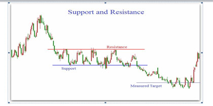
Sample chart showing Support & Resistance indicators
From the above chart, it can be construed that a Resistance is the uppermost threshold above which the stock prices generally won’t surpass and Support is the bottommost threshold of the stocks. It can also be derived that the Support and Resistance were found to be consistent during a specific period. The periods before and after this specific period are considered as the major shifts in the market’s psyche towards this particular stock.
Thus both Support and Resistance are the levels at which the investors wish to either buy the stocks (i.e. during Support period) and/or sell them (during Resistance period). Hence an investor should know about these two traits of the technical analysis which are of utmost importance for taking a sound decision.
4.2 How to Use Support & Resistance
Support is the bottom floor that holds the stock price from falling down further and thus it becomes the basis for buying the stocks. On the other hand, Resistance is the top ceiling that prevents the stock price to reach new heights and thus becomes a good proposition for selling the stocks. These two traits also indicate the static period within which the price of the stock did not go beyond the thresholds of Support and Resistance.
4.2 Measurement of Support & Resistance
It has become a universal practice to denote these trends in round figures i.e. 10, 20, 30 up to 1,000 or more. These figures would help the analysts and/or investors to understand the market psychology and the shifts. Let us understand this with one example.
Assume that the initial stock price of M/s. XYZ Inc. If the price hits a round figure like 50, investors would consider it as the Support and will purchase the stocks. As we have seen above, Support is the floor level which holds the price from falling down further. Hence, investors would assume that the stock price of XYZ Inc. would not reduce further and that is the lower price to buy the stocks.
On the other hand when the trend line reaches a major round figure, say for example 80 which has been identified as the Resistance level for this particular stock, investors will indulge in selling the stocks as it can bring profits to them.
Likewise, the measurement of Support and Resistance attributes in terms of round numbers help the investors to benchmark the lowest and highest prices of the stocks and trade them accordingly.
4.3 What happens if Support & Resistance levels Breached?
Well, the breach of these two extremes of a stock is considered as a paradigm shift in the market psychology and would trigger the role reversal of these attributes. That is, Support will become Resistance and vice versa.
Let us take the example of XYZ Inc. again. It is understood that 50 is the Support level i.e. lowest price of the stocks. If the price slips below 50 i.e. say to 40, then this new round number will become the Resistance i.e. the ceiling or highest price of the stock and further downtrend will be considered as Support.
Take a look at the below diagram to understand the concept with better clarity.
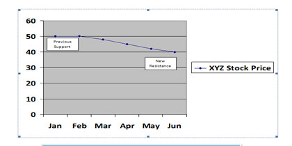
Sample chart showing Role Reversal of Support & Resistance
From all the above information it can be concluded that Support and Resistance together make an inseparable part of technical analysis and investors should make them aware of the knowledge on how to read, understand and analyze these two attributes.
5.0 Know the Volume
So far we have tried to understand the price patterns of a stock and now, in this section, we would be learning about ‘Volume’ of a stock.
5.1 Definition of Volume
In its literal sense, Volume means ‘the total amount of something.’ This word almost holds the same meaning in technical analysis as well. The financial definition of volume is ‘the total amount of stocks/shares of particular company that were traded over a particular time frame’ Here time frame could be anything like few hours, weeks or months. Technical analysts give utmost importance to Volume and would show it on the charts distinctively.
5.2 Understanding the Volume Chart
Look at the below chart:

Sample chart showing ‘Volume’ of a stock price
The above long-term technical analysis chart of a particular company is showing a section called ‘Volume’ that which denotes the ups and downs of number of stocks traded between February to December. (See the bottom portion of the graph marked in Red color rectangle).
Volume chart indicates how many numbers of the stocks were traded during a given time period and show its trend i.e. upward or downward. If we take a relook at the above graph, we can understand that stocks have achieved highest peaks between Apr-May, July-August and between September-November and the height peak is around 90M. Its lowest peak can be seen at the end of December where it has reached around 20M mark. We can also understand the mean volume i.e. average volume of traded stocks which is between 50M – 40M.
Thus, the Volume chart gives an overall picture of the performance of the stocks in terms of their quantity (not price!).
PLEASE READ THE 4TH PART OF THIS TOPIC.