THIS IS IN CONTINUATION OF THE 3RD PART.
- technical-analysis-of-stock-trends.html
- technical-analysis-of-stock-trends-part-2.html
- technical-analysis-of-stock-trends-3.html
- technical-analysis-of-stock-trends-4.html
5.3 Importance of knowing Volume
Knowing the price is just one side of the coin while knowing about the Volume is another side. Technical analysts use the Volume patterns to understand the ‘Role Reversal’ of Support and Resistance traits (which were discussed in Section 4).
How Volume helps the analysts or investors?
Take a relook at the Fig 5.1 and try to compare the volume graph with the price trends. If the volume graph is moving in sync with the price trends then it can be understood that the stock prices are witnessing a real growth. If the volume graph is not in sync with price trends, then there is something wrong with the stocks.
Let us assume that the stock price of XYZ Inc. has jumped by 10% from the previous day’s session then how should an investor perceive this jump? By looking at the volume of the stocks, investors can understand the healthiness of this jump. If the volume has grown in good numbers then the 10% jump can be construed as a healthy trend but if volume has not picked up with the price trend, then the jump needs further probing.
6.0 About Charts of Technical Analysis
So far, we have discussed about the aspects of Technical Analysis and its Chart patterns. Now, let us have a closer look at what are these charts?
The chart of technical analysis is similar to the graphs that we draw for mathematical or statistical purposes. A chart is a diagram which shows the relationship between different parameters or entities by means of bars, cylinders or lines.
Charts drawn by the technical analysts are the two dimensional ones which draw the relationships between important parameters like price, timeframe and volume.
6.1 Chart Parameters
Technical analysis charts do show X and Y axis, just like a typical graph. As we saw in the above section, three important parameters i.e. Price, Time and Volume will be mapped along these axis to draw the representations by the data.
In a typical graph of a technical analysis, timeframe is generally shown on the X-axis while the price points will be shown on Y-axis and volume chart would also show the time periods on X-axis and quantity of traded shares on Y-axis.
The time scale, drawn on X-axis, and the frequently used time scales are intraday i.e. hours, days, weeks, months and years. Charts would become more detailed when the time frame used is short. Intraday graph shows the trading done from the opening bell up to the closing bell of the stock exchange. Daily chart shows the entire day’s transactions in a single point and generally depicts the closing prices of the day.
Other charts like weekly or monthly or annual ones are used to do the long-term analysis of the stocks. In these graphs the data condensation happens according to the time periods i.e. in a weekly chart each week’s closing price (high or low peak) will be shown and so is in monthly chart or annual chart.
6.2 Chart Types
In technical analysis, 4 types of charts are being used by the analysts and investors and the usage of these types would depend on the skill levels of the user. The chart types are:
- Line Chart
- Bar Chart
- Candlestick Chart
- Points & Figure Chart
Line Chart
This is the most basic type of chart which plots only one parameter i.e. the closing price of the stock and thus forming a simple line. Due to its minimalist approach of depicting the data, Line Chart is easily understandable and thereby does not divert the attention of the users.
Here under is the sample Line Chart.
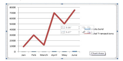
Line Chart
Bar Chart
This is the most preferred chart type of many analysts and investors. This is a versatile chart type which captures the open, high, closing and low prices of a particular stock during a given time period.
Each bar, depicted on the chart, is denoted by a single vertical line having two marks at each end of it. The top of the bar indicates the high price of the day or whatever timeframe used and the bottom part denotes the lowest price. The left of the horizontal tab indicates opening price and the right side of it indicates the closing price. This chart is also called OHLC Chart i.e. Open-High-Low-Close chart.
Here under is the sample Bar or OHLC Chart:
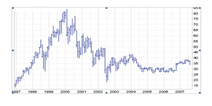
Bart Chart (OHLC Chart)
Candlestick Chart
This is a ‘color coded’ chart type which uses the similar parameters of bar chart i.e. Open, High, Low, Close prices of a stock. This chart differentiates itself from the Bar chart in its graphical presentation of the OHLC data. See the below sample chart to understand it better:
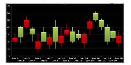
Candlestick Chart
In the above chart, we can see that two ‘colored candles’ are used instead of the lines or bars. The green colored candle denotes the Bullish day and the red one denotes Bearish day. In simpler words, green candle indicates that the closing price of the stock on a given day is higher than the opening price. The red colored candle indicates the opposite meaning of the green i.e. the stock has suffered from a lower price closing than the opening price.
We can see two vertical lines at the top and bottom of each candle. The bottom vertical line of the green candle denotes the opening price and top vertical line denotes closing price of the stock on that day. In the red color candle the bottom line denotes closing price and the top line indicates the opening price. We can also see that the lengths of these two lines vary due to the fluctuations in opening and closing prices. Thus candlestick chart though repeats the data similar to a Bar chart is more of visual clarity.
This is not a new method and historical records say that Japanese have invented this method way back in 16th century!
Points & Figure Chart
This chart has got a noteworthy and distinctive style of representing the data of the stocks. This chart does not give importance to the time frames and denotes the price fluctuations alone. Maybe because of this, Points and Figure chart is not in wide usage by analysts and investors. Following is the sample chart:
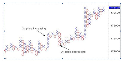
Points & Figure Chart (Sample)
As shown in the above figure, Points & Figure chart uses X and O symbols to display the price patterns. X indicates the price increase and O hints the price decrease. At any given time, either X or O alone will be marked but both of them are never used together.
This chart is also is a minimalist type like that of Line chart and removes the distortions generally caused by the timelines.
PLEASE READ THE 5TH PART OF THIS TOPIC.